Make the page behind a Story link worth the tap
A link sticker can bring someone to your site. The real work is making the destination answer what the Story promised.
The archived FollowRio article explained the old swipe-up route. Meta later moved Stories links to a sticker model. The enduring question is editorial: what does the person expect after tapping, and how quickly can the destination deliver it?
Write one honest promise in the Story
Name the destination precisely: 'See the full sizing chart' is better than 'You need to see this'. Show enough context that a person can decide whether to tap. If the page is a product page, say so; if it is an educational guide, the link should lead to the guide rather than an unrelated checkout.
Give the sticker a clear label and place it where it does not cover essential content or interface controls. Check the Story on a phone before publishing. People who do not tap should still understand the basic message, while the page provides detail that cannot fit well in a short Story.
Answer the promise above the fold
The destination should load with a visible title, useful first paragraph and a path to the promised answer. A link to 'size guide' should not begin with a newsletter modal or a list of unrelated products. If the page is long, use clear headings and an accessible table of contents.
Make the page usable on a narrow screen. Check legible text, buttons that can be tapped, alt text for informative images and a visible privacy explanation if the page asks for data. Keep tracking limited and disclose what you collect. The page should work for a visitor who arrives without knowing the account's history.
Measure whether the visit helped
Decide on a meaningful next action: viewing a chart, downloading a checklist, asking a question or completing a legitimate purchase. Link taps alone cannot tell you whether the answer was useful. If you use analytics, compare visits with the page's actual purpose and respect the site's privacy choices.
Review the route from Story to answer yourself and with one person unfamiliar with the site. Where do they hesitate? Does the page still match the Story when an offer ends or a feature changes? Update or remove stale Stories and landing pages rather than keeping a path that promises something no longer available.
The promise-to-page check
Use this before every important Story link, whatever the current Instagram control is called.
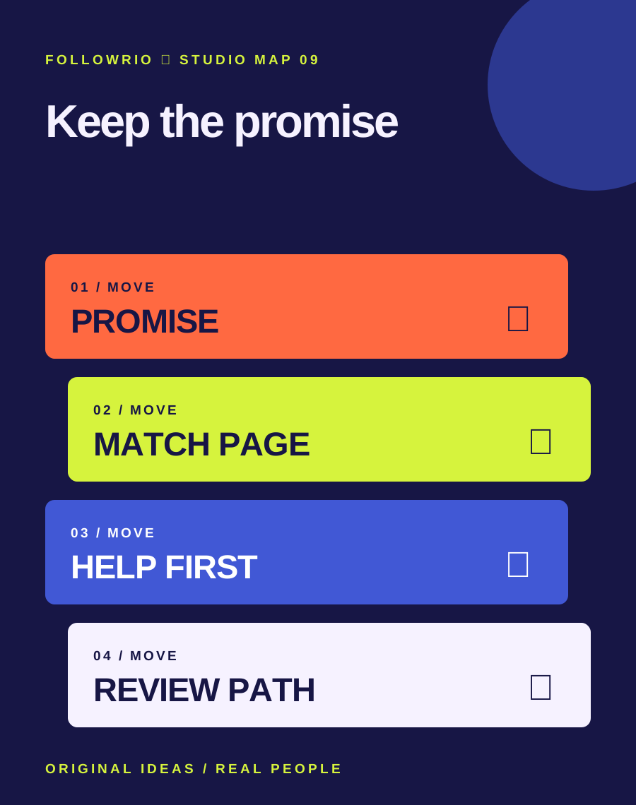
- Promise
State exactly what the tap will reveal.
- Match
Use the same topic and language at the page entrance.
- Help
Give the promised answer in an accessible mobile layout.
- Review
Check a meaningful outcome and update stale claims.
Fictional example: a maker posts a Story about choosing a notebook for fountain pens. The link leads directly to a comparison of paper, binding and ink tests, with a clear note about which notebooks are sold by the maker. A visitor can use the advice even if they do not buy. The maker later updates the page when one paper stock changes.
The 2020 swipe-up instructions are historical. Check Meta's current link controls and eligibility in the app; do not publish steps that depend on the old interface.
Read the context.
Archive captures identify the old question. Platform features and support routes can change; these links are starting points for checking the current state.